This page was translated by AI. Please be forgiving of any mistakes.
‹ Photo Notes · 15 ledna, 2012
Somewhere I once heard that this sentence was uttered by Professor Šmok (like a lot of others – sometimes I have the feeling that when someone wants to say something clever about photography, they attribute it to Prof. Šmok – let’s hope he doesn’t become the Chuck Norris of Czech photography – in any case his name is often waved around by people whom Mr Šmok might perhaps slap if he saw how his name is taken in vain, but that is not the subject of the article…).
Whoever the author of that sentence was, I completely disagree with it, although I understand its message. On the contrary, I think that a good centred composition (when we can find a justification for it) can be a matter for connoisseurs. In the vast majority of photographs, however, we have no justification for it, and then it is used the way the title describes.
In the previous article we talked about vertical composition; today we finally touch on the horizontal arrangement of the shot too. Better than many words is a clear demonstration.
 |
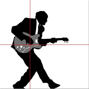 |
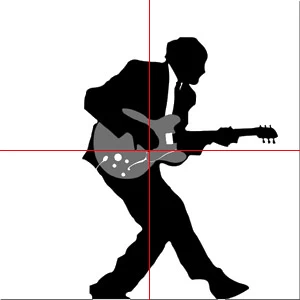
| composed on the centre, on the left unnecessarily much space behind the back that can hardly be justified, on the right tight, the image feels restless | composition shifted more to the left, the unnecessary space behind the back is gone, space has appeared in front of the photographed person, the image feels more dynamic and at the same time harmonious |
One of the principles is that there should be more space in the direction the person in the photograph is looking (all principles and rules have their exceptions, for example when you want the photographed person to „lead“ you out of the shot, somewhere away into space). But what to do if the person in the shot is looking straight at you? Try the same – shift her left or right depending on the other important objects in the shot.
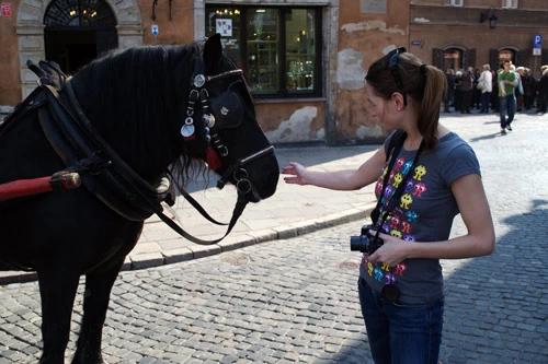
With this shift you get a more balanced photo, and even if you do it entirely intuitively (or precisely because of that), you place the important objects in the photograph in the places called
THE GOLDEN SECTION
More than golden section I like the term golden ratio (1:1.618…, the number φ [phi], which is the ratio of adjacent numbers in the Fibonacci sequence), but the terms don’t matter much. The number 1.618 is also called the Divine number, the Divine proportion, the Most beautiful number etc., and we are literally surrounded by it, which automatically makes it natural to us. That is why we like shapes, forms, creations and works in which the number 1.618 is reflected. This number means harmony. Countless times we can observe it in nature, in our own body, in architecture and art, and know that when you turn to look after a harmonious face or figure on the street, you are looking at a lot of golden ratios. Don’t believe it? Watch a short video:
{youtube}085KSyQVb-U{/youtube}
For further and exhaustive information about the golden section I recommend, for example, this article on Wikipedia (in Czech).
It is quite clear to me that many a reader is now shaking their head and imagining me running around with a tape measure and compass while shooting, or, God forbid, doing this themselves in an effort to get better family holiday photos. On the contrary, I really like one anonymous saying that goes roughly like this:
„The golden section is the reason why we like something, not a means to make us like something“
That’s right. When composing a shot I don’t think about where the golden section lies, how the golden ratios come out here or there. I let myself be guided by intuition, and mostly what I like, what seems harmonious to me, lies precisely in the golden section or is composed of various golden proportions.
For even greater simplification I can add that the ratio 1:1.618 corresponds roughly to thirds, so when you want to compose consciously roughly on the golden section, divide the scene horizontally and vertically into thirds and shift the photographed objects into them; it won’t be exact, but that isn’t the point at all. The result will in 90% of cases still be far better than that unjustified centred composition.
So when is there a reason to choose a centred composition? It probably can’t be defined precisely, but one case is the effort at symmetry.
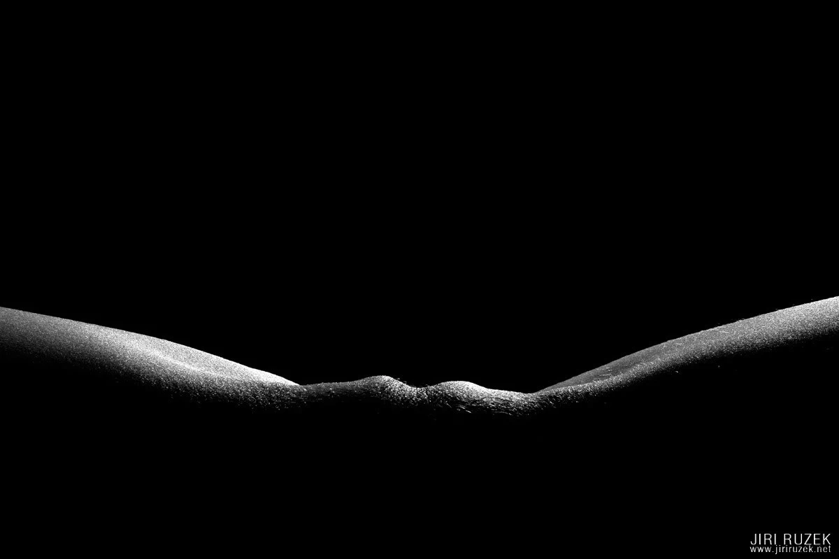
Again I pull out the photograph of the Czech Central Highlands, but it suits this purpose.
Here the centred composition was the best possible solution for me.
Another reason I see is, for example, an emotionally strong en-face portrait, where a central composition amplifies the urgency of the expression and mood; the photograph is somehow bolder.
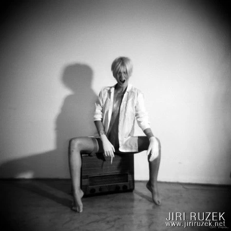
I can’t think of other reasons at the moment, which doesn’t mean they don’t exist. The purpose of this article was to explain that if you have no reason to compose on the centre, it is always better not to.
Want to learn more? Visit the nude photography course.